
Some homes are designed in layers. Chari Residence was designed with decisions.
Every choice here had a reason. Every detail had intent.
Created by Chie Design LLP, this project reflects how a high-end interior designer approaches a space, not just visually, but strategically.
Site Understanding & Client Mapping
Before layouts, before materials, before even mood boards, we started with behaviour. Not aesthetics.
What we observed:
The clients wanted:
- A calm home, not a statement home
- Clean spaces that still feel warm
- Strong functionality, but visually hidden
But here’s what stood out:
- They weren’t reacting to what they liked.
- They were reacting to what they didn’t want.
No clutter. No heaviness. No visual stress.
Our takeaway:
This wasn’t a design brief, it was an emotional brief. So instead of asking “what style?”, we asked: How should this home feel at 9 pm after a long day? That answer drove everything.
Spatial Planning: Fixing Flow Before Form
Unlike many homes, the issue here wasn’t lack of space. It was how the space was experienced.
What we identified:
- Visual breaks between zones
- Storage interrupting openness
- Furniture layouts that didn’t support movement
What we changed:
- Created visual continuity across rooms
- Aligned furniture with movement paths
- Integrated storage into architectural lines
Key shift:
We stopped designing rooms. We started designing transitions. Because in high-end interior design, how spaces connect matters more than how they look individually.
Concept Development: Building a Controlled Design Language
Once the flow was resolved, we moved into concept. But instead of moodboards full of inspiration, we focused on control.
What we locked early:
- A tight neutral palette
- Limited material families
- Consistent finishes across spaces
Why this matters:
- Too many materials = visual noise.
- Too many colours = distraction.
So we simplified. Not to make it minimal, but to make it cohesive.
Core palette:
- Warm beige base
- Soft greys for balance
- Natural wood for depth
- Muted greens/blues for life
This ensured the entire home felt like one story.
Design Development: Where Details Start Carrying Weight
This is where the project actually becomes real. Not through big ideas—but through small decisions.
What we focused on:
- Edge detailing
- Material transitions
- Furniture proportions
- Lighting placement
Example: Wardrobes
Instead of:
- Flat laminates
- Heavy shutters
We introduced:
- Cane inserts for breathability
- Wooden frames for structure
- Neutral panels for calmness
Result: Storage becomes part of the design, not an interruption.
Lighting Strategy: Creating Mood Without Drama
Lighting wasn’t added later. It was designed alongside the space.
What we avoided:
- Harsh spotlights
- Overly bright ceilings
- One-source lighting
What we implemented:
- Ambient lighting for softness
- Accent lighting for depth
- Decorative lighting for identity
Key principle:
Light should reveal the space slowly, not expose everything at once. This is what gives the home that calm, layered feel.
Execution: Translating Design Into Reality
This is where most designs fail. Not because of ideas, but because of inconsistency.
What we ensured during execution:
- Precise alignment of panels and furniture
- Consistent colour tones across materials
- Seamless junctions between surfaces
- Close coordination with vendors and site teams
Site involvement:
Regular site visits weren’t optional, they were necessary because even a small mismatch in tone or alignment can break a neutral, high-end space.
Space Breakdown: Design Decisions in Action
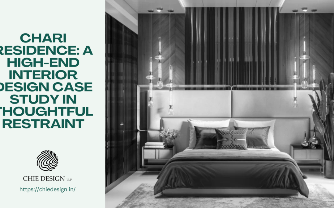
Master Bedroom: Designing Stillness
What we thought:
Bedrooms should reduce visual activity.
What we did:
- Kept the backdrop minimal
- Used symmetry to create calm
- Introduced soft textures instead of bold elements
Detail that matters:
- Lighting height and placement.
- It was adjusted to create intimacy, not brightness.
Outcome:
A space that slows you down without trying.
Second Bedroom: Integrating Function Seamlessly
What we thought:
Function should not feel added.
What we did:
- Integrated desk into wall design
- Used floating elements to reduce visual weight
- Kept storage aligned with architecture
Smart move:
Circular lights to break linear rigidity.
Outcome:
A multi-functional room that still feels calm.
Dining Area: Controlled Expression
What we thought:
The home needed one expressive moment.
What we did:
- Introduced a mural wall
- Simplified furniture
- Layered pendant lighting
Why it works:
One strong element replaces multiple small ones.
Outcome:
A space that feels intentional, not decorated.
Living Room: Balancing Comfort and Structure
What we thought:
The living room should feel used, not styled.
What we did:
- Mixed seating instead of matching sets
- Introduced soft accent colours
- Anchored the space with artwork and rug
Key detail:
Plants used naturally, not decoratively.
Outcome:
A space that adapts to everyday life.
Final Outcome: When Design Feels Invisible
Chari Residence doesn’t rely on standout features. It relies on consistency. You don’t walk in and say “wow”. You stay, and then you realise everything just feels right. That’s the real outcome of good high-end interior design.
About Chie Design LLP
At Chie Design LLP, design is not about adding layers. It’s about refining them. As a high-end interior designer, the focus is always on:
- How a space feels
- How it functions
- And how it holds up over time
Chari Residence reflects that philosophy, calm, intentional, and deeply considered.