
Luxury can easily go wrong. Too much gold, too many finishes, too many statements—and suddenly, it feels heavy instead of refined.
Bhansali Residence was never going to be that. Designed by Chie Design LLP, this home is a study in how a top interior designer in Pune brings richness into a space without letting it overpower the experience.
Because here, luxury wasn’t about adding more. It was about controlling more.
Site Understanding: When the Brief Says “Luxury,” But Means “Comfort”
At first glance, the brief sounded straightforward.
The client wanted:
- A luxurious home
- Rich finishes
- A premium visual experience
But once we dug deeper, the real expectation became clear:
- They didn’t want a showroom.
- They wanted a liveable luxury home.
That meant:
- No visual clutter
- No overwhelming shine
- No spaces that feel intimidating to use
Our first thought:
Luxury needs to feel soft before it feels grand. That shifted the entire design direction.
Spatial Planning: Creating Flow in a Visually Rich Home
The challenge here wasn’t lack of space. It was managing density. Because when you introduce rich materials, even a large space can start feeling heavy.
What we identified:
- Long visual corridors needed softness
- Living areas required better zoning
- Bedrooms needed emotional separation from social spaces
What we did:
- Broke visual monotony using layered elements
- Created clear functional zones without physical barriers
- Ensured movement felt uninterrupted
The goal wasn’t openness. It was effortless movement through richness.
Concept Development: Defining Controlled Opulence
Luxury can’t be random. It needs a system.
What we locked early:
- A warm neutral base
- Gold accents, but used selectively
- Textures layered through fabric, not patterns
What we avoided:
- High-contrast combinations
- Overuse of metallic finishes
- Too many statement elements in one space
Core palette:
- Creams and beiges
- Soft browns
- Muted greens
- Brushed gold accents
The idea: richness without noise.
Material Strategy: Making Every Surface Count
With the best interior designer in Bangalore, materials do the storytelling. But only if they’re controlled.
What we used:
- Marble flooring for base luxury
- Upholstered furniture for softness
- Textured wallpapers for depth
- Glass and reflective finishes in limited zones
Key move:
We balanced hard and soft surfaces.
- Too many hard finishes = cold luxury
- Too many soft finishes = flat design
We stayed right in between.
Lighting Strategy: The Real Hero of This Home
Lighting in this project wasn’t decorative. It was structural.
What we thought:
If lighting goes wrong, the entire luxury falls flat.
What we did:
- Used chandeliers as focal anchors
- Added cove lighting to soften ceilings
- Introduced wall sconces for depth
- Ensured warm light temperature across spaces
Key principle:
Light should enhance materials, not compete with them.
Execution: Precision Was Everything
This wasn’t a forgiving design. Every detail had to be exact.
What we ensured:
- Perfect alignment of panels and mouldings
- Consistency in gold tones across fixtures
- Seamless transitions between materials
- Tight coordination with on-site teams
Because in luxury interiors: Small mistakes don’t look small.
Space Breakdown: Where Design Decisions Come Alive
Living Room: Soft Luxury, Not Loud Luxury
What we thought:
Living rooms often become too formal in luxury homes.
What we did:
- Used soft-toned sofas to reduce visual weight
- Added gold accents through lighting, not furniture
- Introduced plants to break material heaviness
Key move:
Layered seating instead of a single dominant sofa.
Outcome:
A space that feels premium but is still inviting.
Dining Area: Structured Elegance
What we thought:
Dining spaces should feel composed, not casual.
What we did:
- Created symmetry through furniture placement
- Added wall panelling for depth
- Used a statement chandelier as the central anchor
Detail that matters:
The rug. It grounds the table and visually defines the space.
Outcome:
A dining area that feels formal but not stiff.
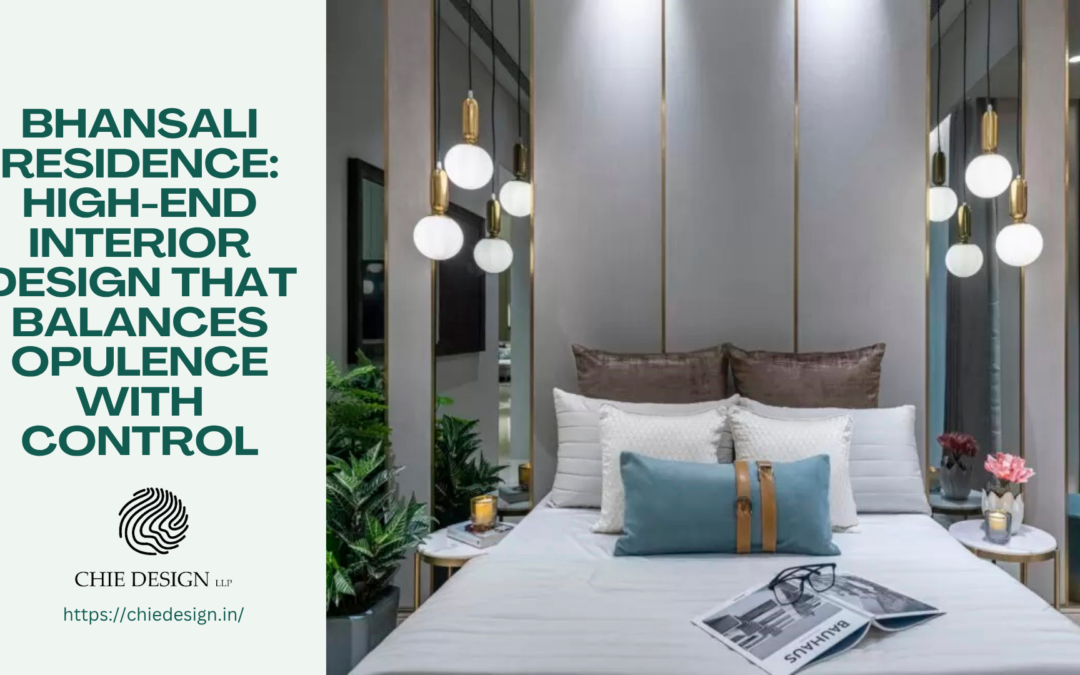
Bedrooms: Where Luxury Softens
What we thought:
Bedrooms shouldn’t carry the same intensity as social spaces.
What we did:
- Reduced contrast
- Increased fabric usage
- Introduced softer lighting layers
Visual trick:
Large curtains to diffuse natural light.
Outcome:
Spaces that feel restful, not staged.
Walk-in Wardrobe: Functional Luxury
What we thought:
Storage should feel like part of the luxury experience.
What we did:
- Used glass shutters for visual lightness
- Integrated internal lighting
- Added a dressing zone within the layout
Key detail:
Transparency.
It makes the space feel larger and more refined.
Outcome:
A wardrobe that feels like a boutique, not storage.
Final Outcome: Luxury That Feels Effortless
Bhansali Residence doesn’t overwhelm you. It surrounds you.
You notice:
- The warmth
- The balance
- The quiet richness
Nothing feels accidental. And nothing feels excessive. That’s the difference between decorating…and true high-end interior design.
About Chie Design LLP
At Chie Design LLP, luxury is never about excess. It’s about intention. As a high-end interior designer, the focus is always on:
- Balance over boldness
- Comfort over display
- And experience over appearance
Bhansali Residence reflects that perfectly, refined, controlled, and designed to be lived in.